Yes, I know the first writing task on the academic version of the IELTS can seem puzzling and daunting at first glance because of the figures, percentages, and diagrams, but believe me, it is way easier to deal with than it appears when you apply this easy strategy!
To begin with, you are only required to summarize or report on the content of the picture or diagram. And you are doing this within 20 minutes and in a minimum of 150 words.
Do not fret about having to manufacture points or ideas. That is NOT the expectation at all; Imagine, reporting to a friend the structure of a new site you want him to visit. You want to ensure your friend leaves that conversation with a clear mental picture of the key details about the building, right?
The requirement for this task is almost the same as the analogy, except that now, you are putting your details in writing, and you are not analyzing the image, so to speak. You are simply REPORTING!
On the IELTS, this task comes in different forms: You might have to report on
- a Process Diagram or Flow Chart
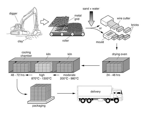
The process that is used to manufacture bricks for the building industry
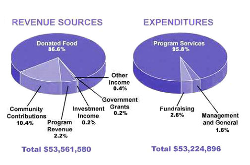
The amount of money that a children's charity located in the USA spent and received in one year, 2016.
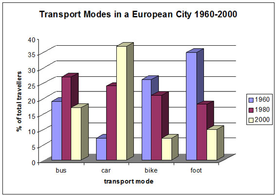
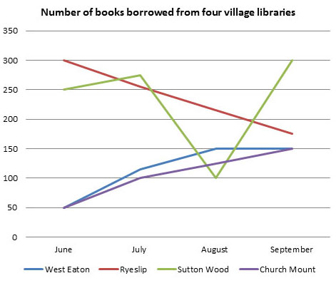
a. The different modes of transport used to travel to and from work in one European city in 1960, 1980, and 2000. b. The number of books that were borrowed in four different months in 2014 from four village libraries, and the pie chart shows the percentage of books, by type, that were borrowed over this time.
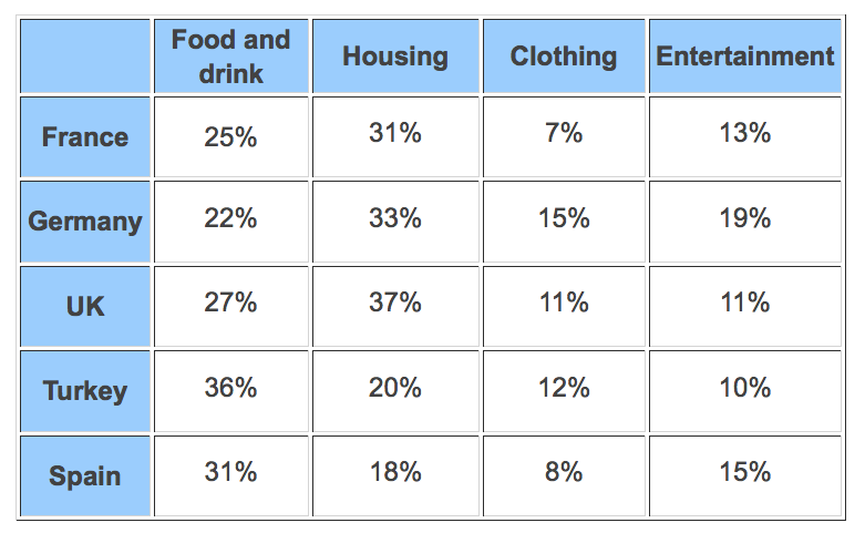
The proportion of monthly household income five European countries spend on food and drink, housing, clothing and entertainment.
You can even a combination of any two above, in which case they always both represent the same topic.
For the record, all these sample questions have been lifted from
IELTS Writing Task 1 Samples (ieltsbuddy.com)
Whichever you are given, of course, you only get to be given just any time, not all, on the exam, ensure that your writing adheres to these parts:
THE INTRODUCTION:
This is by far the easiest to do: you are simply paraphrasing the topic of the diagram that has already been given to you. You can choose to do this by changing the structure of the sentence or using synonyms in place of some of the words that constitute the topic.
THE OVERVIEW
Here you simply state the most obvious details on the picture you have. The peaks and lows, the biggest or smallest figures, or the notable differences between variables.
A DETAILED BODY PARAGRAPH
This time, you get to explore the notable differences in figures, images, and details as you have already hinted at in your overview. You do not have to capture every individual information you can find as neither the time nor the word count gives you that luxury. You can lump details together with a little plus and minus.
A CONCLUSION?
This isn’t very necessary, especially as you are not criticizing, analyzing, or giving your opinion about anything. When it is not an argument, I mean, what are you really “concluding” on, anyway?
Since it is a 20-minute essay, you want to fully utilize your time, and that means leaving nothing to chance and doing the most necessary within time.
Now, THE STRATEGIC STEPS
- First, paraphrase the topic or description of the diagram from what is already given to you without leaving out any essential information, and make sure to include any of the following in front, depending on whether you have a chart, a graph, a table, and so on.
- The diagram shows…
- The image demonstrates…
- The chart/charts reveals/reveal…
- The table illustrates…
- The picture represents…
Original Topic:
"The amount of money that a children's charity located in the USA spent and received in one year, 2016."
Rephrased 1:
The pie charts show the percentage of funds expended and gained by a US children’s humanitarian organization in 2006
Rephrased 2:
The images represent the amount of revenue and expenses incurred by a children’s charity situated in the US in 2006
Rephrased 3:
The charts reveal the monetary gains and outgoings of a US-based children’s charity in the year 2006.
Trust me, I can go on and on with this part. There are endless possibilities for paraphrasing a specific idea in English.
2. Next,
Take a scan of the image for notable differences: what are the most obvious changes between both images? What figures are more pronounced? Are there apparent peaks and lows? This is what you should capture in your overview, knowing that the subsequent paragraph will have to provide details from the images on this.
OVERVIEW
Donated food is the most significant source of revenue in comparison to other sources while program services got a huge percentage of the organization's expenses in the year analyzed. And revenue only exceeded expenditure by a very minimal margin.
3. Next,
Use details and figures to justify the information in your overview. Remember you do not have to capture every single detail precisely. In the case of this pie chart here, we may need to lump two or three figures together with simple additions.
DETAILS
While food presented to the organization can be seen to amount to 86.6% of all that came in within the year, community contributions come close with 10.4%, which is a staggering 76.6% difference. Right next to community contribution is program services with 2.2% and then investment income, government grants, and other sources which all accounted for a mere 0.8% altogether.
On the pie chart representing expenditure, notably, program services take out a whopping 95.8% while fundraising and management general get 2.6% and 1.6% respectively. So, the revenue obtained by this charity, which stood at 53,561,580 dollars, is just sufficient to meet up with its expenditure of 53,224,896 dollars.
Note also that
You will still be graded on almost the same parameters as task 2, I mean, lexical resources, grammar, and structure, but here, most essentially, is the validity of your details. In other words, you do not want to discard all you have learned under task 2 about using a variety of word choices and sentence structures but still staying on topic. Yet, you want to ensure your details are accurate and align with your overview as I have just done here.
Also, you can choose to merge your introduction and overview in one paragraph or separate them. Both options are valid, but for a report, you want to make it as easily assessable by the examiner as possible. Moreover, because we have two charts, I have chosen to summarize the contents of both in separate paragraphs. For a process diagram, on the other hand, I would not have separate body paragraphs since the report will simply be about “one” process.
Now you can practice writing on any of the pictures above and see how that spans out. Feel free to drop your essays in the comment section for review.
Best of luck!
THE COMPLETE REPORT ON THE PIE CHART
The pie charts show the percentage of funds expended and gained by a US children’s humanitarian organization in 2006.
Noticeably, donated food is the most significant source of revenue in comparison to other sources while program services got a huge percentage of the organization's expenses in the year analyzed. And revenue only exceeded expenditure by a very minimal margin.
While food presented to the charity organization can be seen to amount to 86.6% of all that came in within the year, community contributions come close with 10.4%, which is a staggering 76.6% difference. Right next to community contribution is program services with 2.2% and then investment income, government grants, and other sources which all accounted for a mere 0.8% altogether.
On the pie chart representing expenditure, notably, program services have over 90% while fundraising and management general get 2.6% and 1.6% respectively. So, the revenue obtained by this charity, which stood at 53,561,580 dollars, is just sufficient to meet up with its expenditure of 53,224,896 dollars.

24 comments